
About M&I Healthcare
M&I Healthcare is the dedicated trade show for the pharmaceutical, medical and healthcare meetings sector — connecting decision-makers from compliant medical events with premium venues and suppliers around the world.
Built on the proven M&I model, Healthcare extends our hybrid branded house with its own distinct visual identity. While the core M&I logo and structure remain, the palette, typography and tone are tailored to reflect the trust, precision and clarity demanded by the healthcare industry.
M&I Healthcare logo
The M&I Healthcare logo is built on the M&I Core logotype with the addition of the ‘Healthcare’ descriptor. The two-colour split remains, signalling the connections we forge between buyers and suppliers in the healthcare meetings sector.
Primary logo




Logo safe area
Incorrect usage

Don’t rotate the logo

Don’t change logo colours

Don’t stretch the logo

Don’t alter logo proportions
Event product lockups
Event product lockups are designed with precise ratios and spacing to maintain visual harmony and brand consistency. Always use the approved versions to ensure a professional presentation across all communications.


Colours
The M&I Healthcare palette has been crafted to convey trust, clarity and a sense of clinical professionalism. Slate and dark slate anchor the brand, while jade and vital introduce a fresh, healing quality. Dew tones provide softness and breathing space, with mellow used sparingly as a warm highlight.
Primary colour palette
Typography
M&I Healthcare uses Merriweather (serif) for headlines and statements, conveying authority and trust. Circular Light (sans-serif) is used for body copy and supporting text, ensuring clarity and ease of reading.
Body font – Circular Light
Circular (Sans-serif), 300 weight for body copy.
Typographic hierarchy
Hero / Campaign Line (H1)
| Font | Merriweather |
| Weight | 300 (Light) |
| Size | 72px |
| Line height | 110% |
Healthcare connections
Headline (H2)
| Font | Merriweather |
| Weight | 400 (Normal) |
| Size | 42px |
Trusted by senior decision-makers
Body copy (P)
| Font | Circular |
| Weight | Light |
| Size | 18px |
Over the years we’ve listened, evolved and perfected the healthcare trade show experience.
Applications
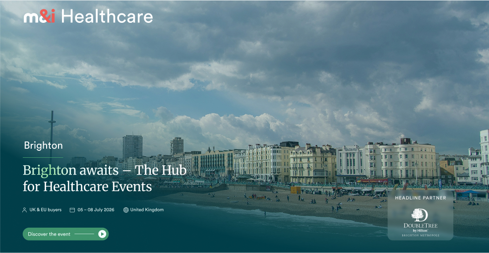
Our application examples demonstrate the consistency and clarity that define M&I Healthcare. Designed and produced to the highest standard, every touchpoint reinforces trust across communications.
Tone of voice
M&I Healthcare speaks with authority, clarity and warmth. Our tone is professional yet human — reflecting the seriousness of the healthcare sector while remaining accessible and genuinely helpful.
Educational sessions terminology
How we talk about it
Words to use
Words to avoid
Photography
View our approved photo library
Explore our pre-approved photo library — a curated collection of high-quality visuals that capture the essence of the M&I Healthcare experience.
Photo librarySupport & requests

Design & marketing requests
If you have a specific design or marketing request, please submit a ticket through our Airtable requests form.
Design & marketing requests
Full brand guidelines
For design and marketing professionals, a comprehensive M&I Brand Guidelines Bible is available upon request.
Request full brand guidelines