About M&I Expo
M&I Expo is the global exhibition for the elite of the MICE industry coming to Abu Dhabi. Exclusively for the ‘MICE 1,000’ — a curated group of senior, influential decision-makers — M&I Expo prioritises quality over quantity.
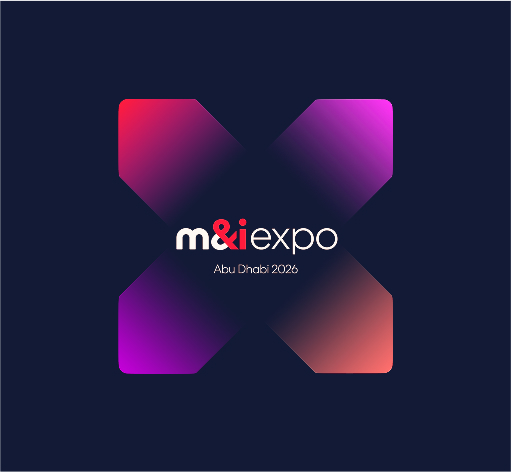
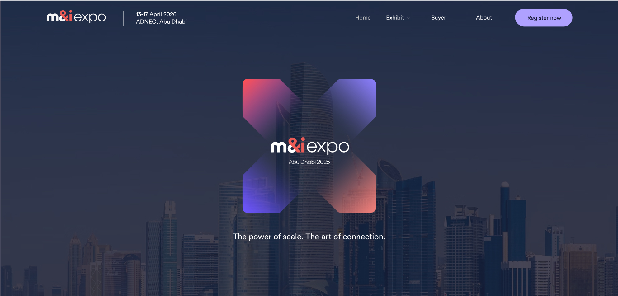
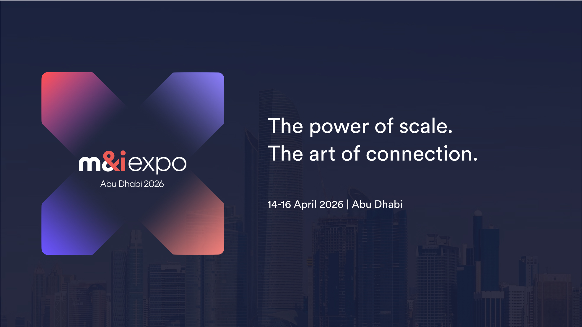
The future of the M&I brand, Expo is the natural evolution of the M&I Core identity, introducing a forward-looking aesthetic with a fresh colour palette, gradients and modern visual treatments. At the centre is the X — a bold marker of innovation, connection, and progress.
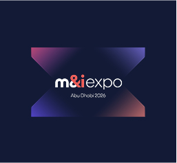
M&I Expo logo
The primary logo for Expo is the full lockup, which combines the logotype with the X symbol. This version should be used whenever possible to represent the brand in its most complete form.
Primary M&I Expo logo lockup
M&I Expo logotype


Event product lockups


M&I Expo ‘X’ symbol
The X serves as a recognisable holding device for headlines. Use white text on dark backgrounds and raven text on light backgrounds.


Incorrect logo usage
Don't stretch or distort the logo
Don't crop any part of the logo
Don't change the logo colours
Colours
The Expo palette builds on the M&I Core foundation, retaining Raven as its base. Lotus (purple) becomes the primary accent, with Coral used selectively for highlights. Gradients add energy and futuristic vibrancy.
Gradients
GRADIENT 1
HEX FD4F54 + CF60E1
GRADIENT 2
HEX 6B54FE + CF60E1
Typography
We utilise Circular Book for all content, employing a single weight to achieve a consistently premium appearance. When there is no clear hierarchy between H1 and body text, the title may use Circular Medium, but use sparingly.
Primary font – Circular
Download CircularTypography hierarchy
Hero / Campaign Line (H1)
| Font | Circular |
| Weight | 500 (Medium) |
| Size | 70px |
A global exhibition for the elite of the MICE industry
Headline (H2)
| Font | Circular |
| Weight | 400 (Normal) |
| Size | 42px |
M&I Expo is a world-class exhibition
Body Copy (P)
| Font | Circular |
| Weight | 400 |
| Size | 18px |
A three-day programme incorporating one-to-one pre-scheduled meetings, hosted lunches, and evening socials.
Application examples
Our application examples demonstrate the craft and consistency that define the M&I Expo brand across every touchpoint.
Communications & Tone of voice
How we talk about it
Words to use
Words not to use
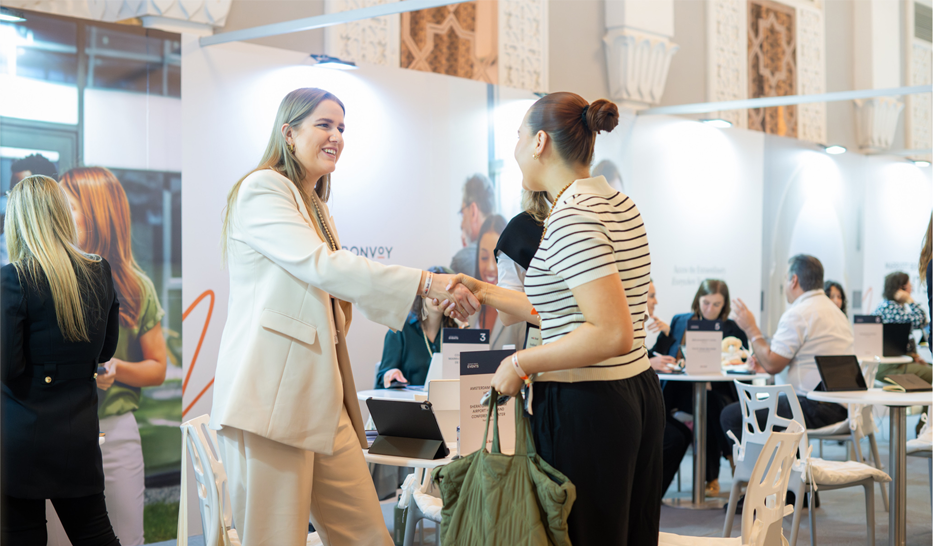
Photography
View our approved photo library
Explore our pre-approved photo library — a curated collection of high-quality visuals that capture the essence of the M&I Expo experience.
Photo librarySupport & requests
Design & marketing requests
If you have a specific design or marketing request, please submit a ticket through our Airtable requests form.
Design & marketing requestsFull brand guidelines
For design and marketing professionals, a comprehensive M&I Brand Guidelines Bible is available upon request.
Request full brand guidelines