Back to guides
Logo
Colour palette
Typography
Applications
Tone of voice
Photography
Support & requests
LUXE by M&I is the reason our brand architecture is defined as a hybrid branded house. Unlike other offerings, LUXE is positioned to act more as a standalone brand within the M&I portfolio. The product name takes precedence, with “LUXE” appearing before “M&I”, signalling its unique status.
The identity is crafted to appeal to a high-end luxury market, with fewer common threads to the M&I Core brand. It features:
This distinctive approach allows LUXE by M&I to stand apart from the rest of the portfolio while still being recognisable as part of the wider M&I brand family.
The LUXE by M&I logotype is the primary logo and should be used as the main identifier across all applications. In addition to the logotype, there is also the LUXE crest.
The crest is not part of the logo, but a recognisable brand symbol that works alongside the primary logotype. Its use should always be considered through design thinking – applied deliberately and with purpose, never as decoration for its own sake. The crest is most effective when used in premium or selective contexts, reinforcing the brand’s luxury positioning without overshadowing the logotype.
Crest should be scaleable in relation to the height of the logo. For example: 1x (same height) 2x, 3x etc
Within the LUXE by M&I environment, this is the only occasion where the general rule of the M&I Core logo being dual-colour is set aside. In this context, the logo is applied in a single-colour (mono) version.
The rationale behind this exception is that LUXE takes precedence in the hierarchy. By removing the Coral accent, the mono version creates a refined, understated, and high-end aesthetic that aligns seamlessly with the luxury positioning of the sub-brand.
The mono M&I logo is not required on all LUXE visuals. Instead, it should be used sparingly and with intention – for example, at a small scale on the cover or back cover of a pack or presentation. In these contexts, it serves to provide clarity and context that LUXE is a product brand within the wider M&I portfolio, without distracting from the LUXE identity.
Don’t rotate the logo
Don’t change logo colours
Don’t stretch or alter the shape of the logo
Our event product lockups are carefully designed with precise ratios and spacing to maintain visual harmony and brand consistency. The examples provided below must not be altered – always use the approved versions included in these guidelines to ensure a professional and cohesive presentation of the LUXE by M&I event name across all communications.
The LUXE Collective Stamp serves as an accreditation mark for attendees. It is provided to clients as a visual symbol of their participation in the 2026 LUXE by M&I events.
The stamp acts as a badge of association with the LUXE community, reinforcing the prestige and exclusivity of the brand. It may be used by attendees across their own communications, marketing materials, or digital platforms to showcase their involvement.
As with all brand assets, the stamp should be applied consistently and without alteration. Approved versions of the stamp are available within the brand library and must always be used in accordance with these guidelines.
The LUXE by M&I colour palette has been crafted with clear intention to support the brand’s luxury positioning. It takes a minimalist approach, with colour applied selectively to create impact without overwhelming the design.
The palette leans towards a dark, refined aesthetic to convey a sense of premium quality and exclusivity. The vibrancy of Marigold is used sparingly – applied only in subtle hints or accents – to add warmth and distinction while maintaining sophistication.
This restrained use of colour ensures that the identity feels elevated, timeless, and aligned with luxury markets, while still remaining recognisable within the broader M&I family.
Dark fawn
HEX 13130E
LIGHT FAWN
HEX 25261B
MARIGOLD
HEX D68B30
LINEN
HEX ECE9E5
DARK LINEN
HEX E6E0D2
Don’t use colours together that cause difficulty visually
Don’t mix and match the vibrant colours – keep colour options on a page within the same family of colours
Don’t use text in colour unless functionally agreed on for links and key information
LUXE by M&I employs a carefully considered combination of typefaces to strike the right balance between differentiation and brand consistency.
This pairing of serif and sans serif creates a sophisticated hierarchy: Garamond provides character and distinction, while Circular ensures legibility and a continued connection to the wider M&I brand family.
This front is a system font, use in instances Garamond Pro is not available to you
Our typography system is designed to bring clarity, consistency, and rhythm to all LUXE by M&I communications. Each level of the hierarchy plays a specific role – from bold, expressive headlines that capture attention, to functional subheadings that provide structure, to body copy that delivers our messages with precision and ease. By following this system, we create content that is both visually harmonious and effortless to navigate, guiding readers through every interaction with the M&I brand.
Note: The font sizes listed below are based on our web copy standards. These values should be treated as a guide rather than absolute rules. Sizes may need to be adapted depending on the application or medium. When adjusting, maintain proportional relationships by following a typographic scale based on the Golden Ratio (≈1.618) to preserve consistency and hierarchy across headlines, statements, and body copy.
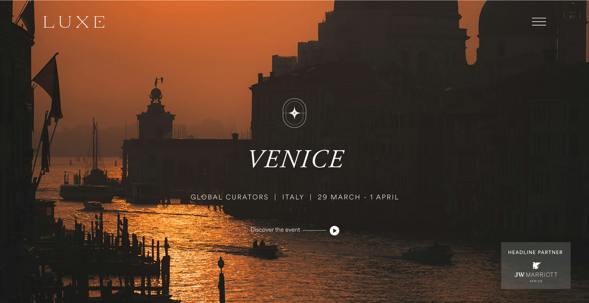
Hero / Campaign Line (H1)
Font | Adobe Garamond Pro |
Weight | 100 (Light) |
Style | Italic |
Size | 84px |
Line height | 110% |
Letter spacing | 0% |
Headline (H2)
Font | Adobe Garamond Pro |
Weight | 400 (Normal) |
Size | 42px |
Line height | 120% |
Letter spacing | 0% |
Statement / Intro (H3 / lead-in):
Font | Adobe Garamond Pro |
Weight | 400 (Normal) |
Size | 28px |
Line height | 120% |
Letter spacing | 0% |
Subsections (H4)
Font | Circular |
Weight | 400 (Normal) |
Size | 21px |
Line height | 120% |
Letter spacing | 15% |
Micro-headings Heading 5
Font | Circular |
Weight | 500 (Medium) |
Size | 18px |
Line height | 120% |
Letter spacing | 15% |
Transform | Uppercase |
Body Copy (P)
Font | Circular |
Weight | Light |
Size | 18px |
Line height | 150% |
Letter spacing | 0% |
Over the years we’ve listened, evolved and perfected the trade show experience.
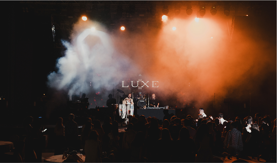
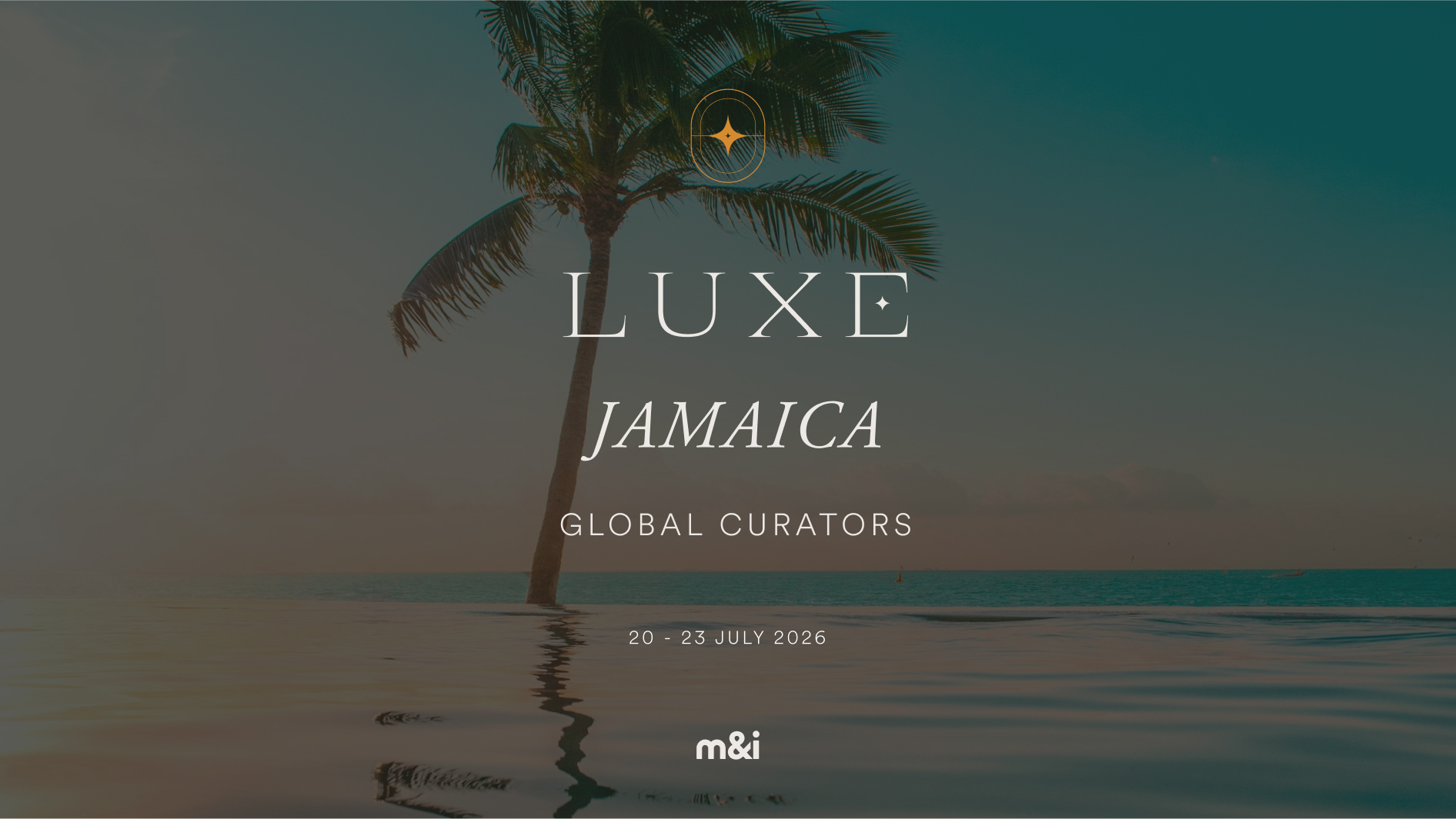
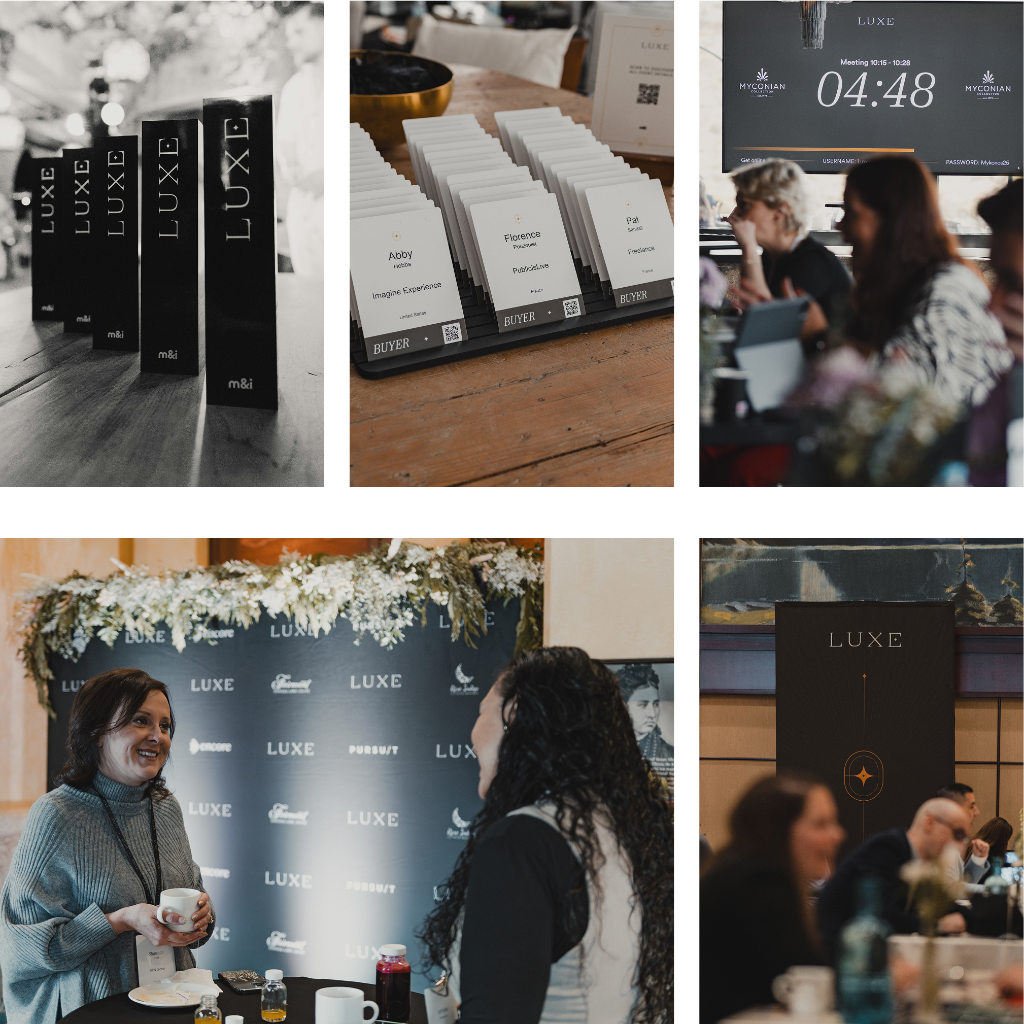
 The result? A much more effective way to network.
Our application examples demonstrate the craft and consistency that define the LUXE by M&I brand. By designing, writing, and producing all materials to the highest standard, we ensure that the brand grows stronger and more recognisable over time, reinforcing trust and impact across every touchpoint.
Explore our pre-approved photo library – a curated collection of high-quality visuals that capture the essence of the LUXE by M&I experience. These images reflect the brand’s tone, style, and energy, ensuring consistency across all communications. Use this library to enhance storytelling, create visual impact, and maintain a cohesive brand presence across events, digital platforms, and marketing materials.
If you have a specific design or marketing request, please submit a ticket through our Airtable requests form. Be sure to complete all required fields and include your name so we can follow up with you promptly.
For design and marketing professionals, a comprehensive M&I Brand Guidelines Bible is available. This detailed resource provides complete specifications for typography, colour, logo usage, imagery, tone of voice, and more. It is available upon request to ensure consistent application of the M&I brand across all channels and touchpoints.
For any questions regarding the application or use of the M&I brand, or if you are unsure about any brand-related decisions, please reach out to the appropriate contact:
Adam Flanagan
Head of Design, Worldwide Events
aflanagan@wwideevents.com
For questions related to logo usage, colour application, typography, imagery, and overall visual design.
Greg Taylor
Head of Marketing, M&I
gtaylor@mi-forums.com
For questions related to logo usage, colour application, typography, imagery, and overall visual design.
M&I Core
M&I Healthcare
LUXE by M&I
M&I Expo
14-16 April 2026 | Abu Dhabi
Benefit from our signature Flagship ROI in Türkiye’s most up-and-coming MICE destination
UK & EU buyers
30 Nov - 4 Dec 2025 | UAE
Discover the Pearl of the Middle East while building lasting MICE connections
Open your property up to a new range of events and opportunities by taking advantage of an online assessment created by our event partner, Healthcare Venues, which will determine if your venue is capable of hosting healthcare meetings and events.
If your property passes, you’ll receive Healthcare Venue certification, verifying you to our buyer network as a specialist healthcare venue.
Tim Chudley
Managing Director, Sundial Group