
About M&I Core
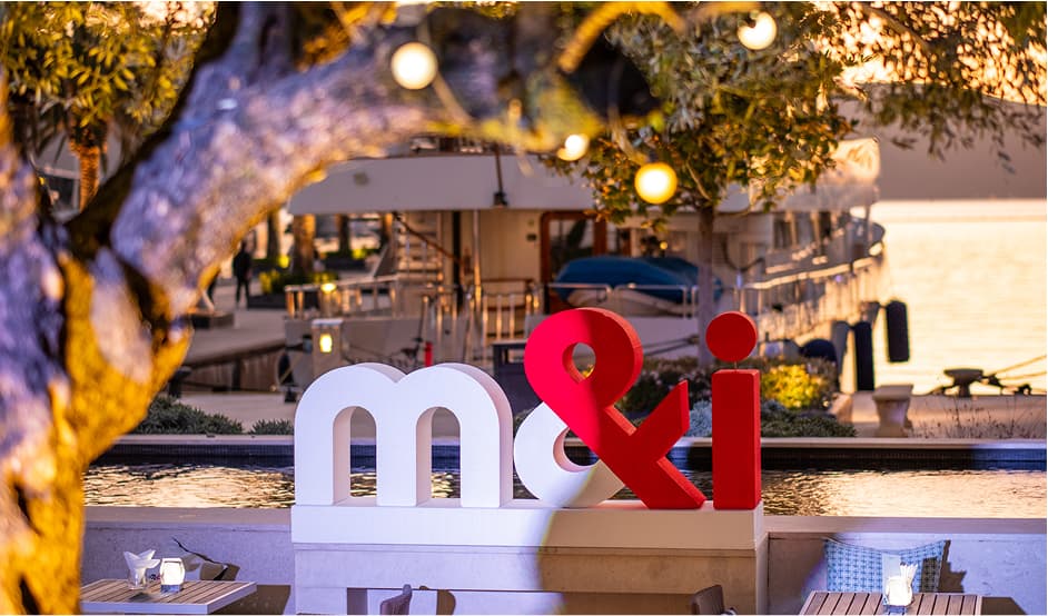
M&I is a global leader in curating high-end networking events that connect premium travel suppliers with handpicked buyers from around the world. Built on a foundation of meaningful relationships, business innovation, and unforgettable experiences, M&I exists to transform how the travel industry connects — blending strategy with soul, and commerce with creativity.
As the core brand in our portfolio, M&I represents the essence of what we do: we create powerful human connections through carefully crafted event formats. Whether it’s an intimate meeting or a large-scale showcase, the M&I identity serves as a benchmark for professionalism, adaptability, and lasting impact. This section outlines the fundamental brand elements that define M&I, ensuring consistency and clarity across all touchpoints.
M&I logo
The M&I logotype is a custom adaptation of our brand typeface and features a two-colour split, symbolising the connections forged by buyers and suppliers coming together.
There are two approved versions of the logo:
- One for placement on light backgrounds
- One for placement on dark backgrounds
The logo should never be used in a single colour, except in the special case of LUXE by M&I, where single-colour usage is permitted.
The logotype is presented in lowercase to convey a friendly and open tone, while the written form of M&I should always appear in uppercase in text.
Our logomark


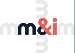
Logo safe area
Incorrect usage

Don’t rotate the logo

Don’t change logo colours
Don’t stretch or alter the shape of the logo
Event product lockups
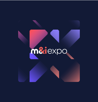
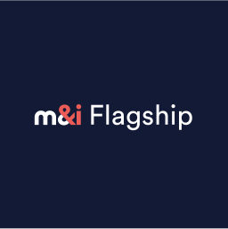
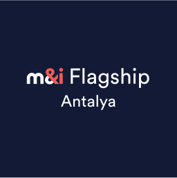
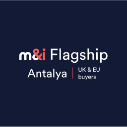
Our event product lockups are carefully designed with precise ratios and spacing to maintain visual harmony and brand consistency. The examples provided below must not be altered — always use the approved versions included in these guidelines to ensure a professional and cohesive presentation of the M&I event name across all communications.
Colours
Our primary colour palette has been designed to balance professionalism with energy, giving the M&I brand a distinctive yet refined presence. It consists of:
Primary colour palette
The palette is applied in a conservative and deliberate way. Raven and Powder serve as the foundation, most often used for backgrounds and core layouts. Coral functions as our primary accent colour, bringing focus and emphasis to key elements. Cobalt is used as a secondary accent, adding vibrancy and depth to the brand.
Both Coral and Cobalt are applied sparingly, reserved for subtle accents and pops of colour that inject energy and life into our identity without overwhelming the core brand look and feel.
Incorrect colour usage

Don’t use colours together that cause difficulty visually. Coral and Cobalt should be used as accent colours on Raven or Powder.

Don’t mix and match the vibrant colours. Keep colour options within the same family of colours on a page.
Don’t use text in colour unless agreed on with the Design Team (ie. for links and key information).
Typography
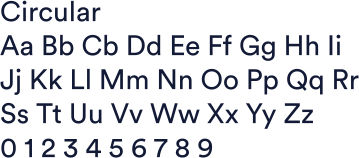
We utilise Circular Book for all content, employing a single weight to achieve a consistently premium appearance.
When there is no clear hierarchy between H1 and body text, the title may use Circular medium, but use sparingly.
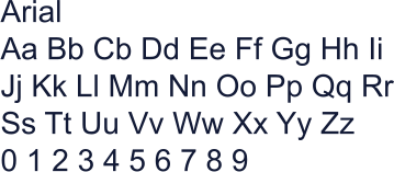
Fallback font

This font is a system font, use only in instances where Circular is not available to you
Typographical hierarchy
Our typography system is designed to bring clarity, consistency, and rhythm to all M&I communications. Each level of the hierarchy plays a specific role — from bold, expressive headlines that capture attention, to functional subheadings that provide structure, to body copy that delivers our messages with precision and ease. By following this system, we create content that is both visually harmonious and effortless to navigate, guiding readers through every interaction with the M&I brand.
Note: The font sizes listed below are based on our web copy standards. These values should be treated as a guide rather than absolute rules. Sizes may need to be adapted depending on the application or medium. When adjusting, maintain proportional relationships by following a typographic scale based on the Golden Ratio (≈1.618) to preserve consistency and hierarchy across headlines, statements, and body copy.
Hero / Campaign Line (H1)
| Font | Circular |
| Weight | 500 (Medium) |
| Size | 70px |
| Line height | 110% |
| Letter spacing | 0% |
Leading the way in MICE events
Headline (H2)
| Font | Circular |
| Weight | 400 (Normal) |
| Size | 42px |
| Line height | 120% |
| Letter spacing | 0% |
The M&I story
Statement / Intro (H3 / lead-in)
| Font | Circular |
| Weight | 400 (Normal) |
| Size | 28px |
| Line height | 120% |
| Letter spacing | 0% |
The M&I story
Subsections (H4)
| Font | Circular |
| Weight | 400 (Normal) |
| Size | 21px |
| Line height | 120% |
| Letter spacing | 0% |
The M&I story
Micro-headings (H5)
| Font | Circular |
| Weight | 500 (Medium) |
| Size | 18px |
| Line height | 120% |
| Letter spacing | 15% |
| Transform | Uppercase |
The M&I story
Body Copy (P)
| Font | Circular |
| Weight | 400 (Normal) |
| Size | 18px |
| Line height | 150% |
| Letter spacing | 0px |
Over the years we’ve listened, evolved and perfected the trade show experience. The result? A much more effective way to network.
Communication & tone of voice
Terminology for Event Operations & Programme
M&I After Dark:
How we talk about it
Words to use
Words not to use
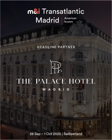
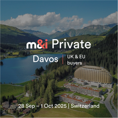
Application examples
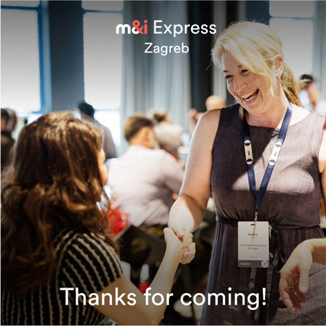
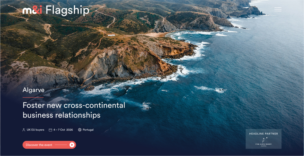
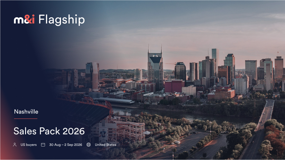
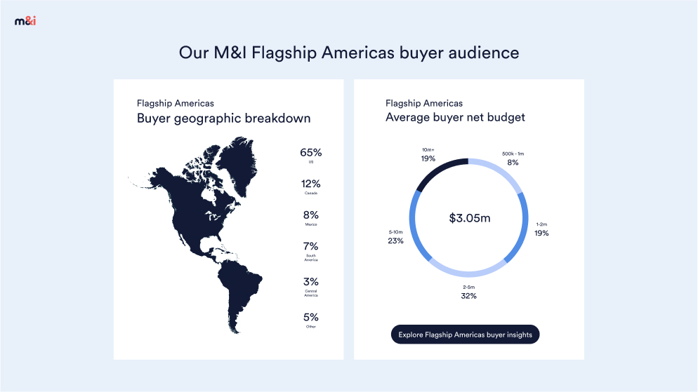
Our application examples demonstrate the craft and consistency that define the M&I brand. By designing, writing, and producing all materials to the highest standard, we ensure that the brand grows stronger and more recognisable over time, reinforcing trust and impact across every touchpoint.
Social posts

Emails
Website
Sales packs
Event Branding
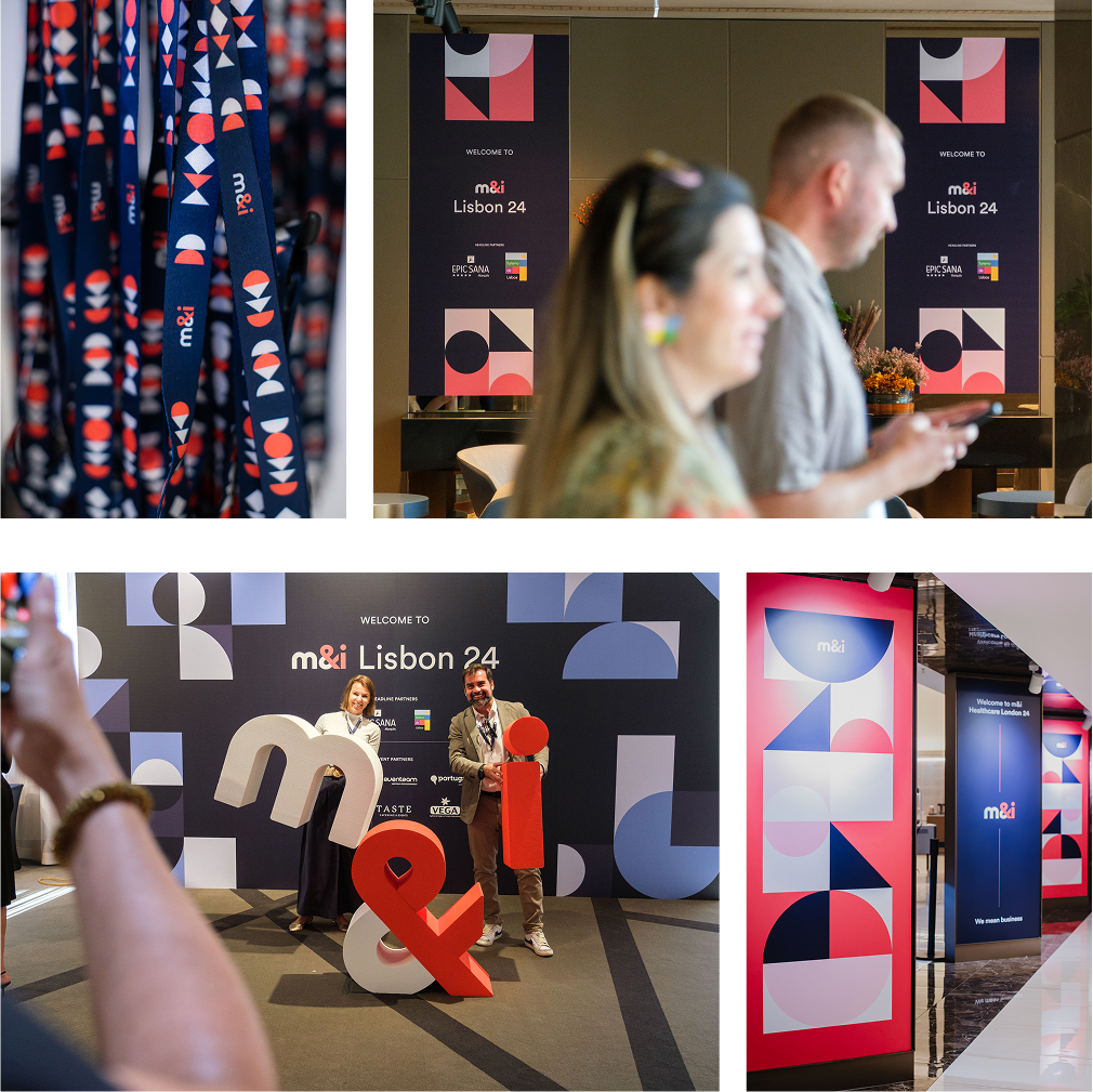
M&I Core photography
View our approved photo library
Explore our pre-approved photo library — a curated collection of high-quality visuals that capture the essence of the M&I experience. These images reflect the brand’s tone, style, and energy, ensuring consistency across all communications. Use this library to enhance storytelling, create visual impact, and maintain a cohesive brand presence across events, digital platforms, and marketing materials.
Photo librarySupport & requests

Design & marketing requests
If you have a specific design or marketing request, please submit a ticket through our Airtable requests form. Be sure to complete all required fields and include your name so we can follow up with you promptly.
Design & marketing requests
Full brand guidelines
For design and marketing professionals, a comprehensive M&I Brand Guidelines is available. This detailed resource provides complete specifications for typography, colour, logo usage, imagery, tone of voice, and more.
Request full brand guidelinesBrand support & contacts
For any questions regarding the application or use of the M&I brand, or if you are unsure about any brand-related decisions, please reach out to the appropriate contact:
Design queries

Adam Flanagan
Head of Design, Worldwide Events
aflanagan@wwideevents.com
For questions related to logo usage, colour application, typography, imagery, and overall visual design.
Marketing queries

Charity Massey
Director of Marketing, Worldwide Events
cmassey@wwideevents.com
For guidance on copywriting, messaging, tone of voice, sub-brand positioning, and marketing content.